Handling Selection
When an option is selected, the 'value' of the menu control will be set to the 'Data Value' of the selected menu option. This means that you can easily add an onchange event to the menu control, and then check its current value to determine what to do. For example, you could have a number of 'Form Submission' actions (Requires Server Controllers), each with a 'Value Check' condition to pick up a specific menu item.
You can also use the Conditional Display capability for a group or control to link its display to a specific menu option.
Dynamic Menu Options
For greater control over the menu options, you can switch to using Dynamic Options in the same way as for other controls. With this option selected, a new Menu Data Location binding will be required on the Bindings tab. This specifies the location of an XML fragment in the data that controls the menu options that will be displayed. The format of this XML fragment must be as follows. Please note that these menu fragments must be in the "http://www.hyfinity.com/mvc" namespace as shown.
<menu id="header_menu" xmlns="http://www.hyfinity.com/mvc">

<item hint="Link to Home Page" id="home" value="Home">
    <event action="http://www.hyfinity.com" name="href" />
</item>
<item hint="Link to Products Page" id="products" value="Products">
    <event action="http://www.hyfinity.com/#products" name="href" />
</item>
<item hint="Contact Details" id="contact" value="Contact">
    <event action="alert('Send us an email!');" name="onclick" />
</item>

</menu>
This contains a top level 'menu' element, with any number of child 'item' elements. Each child item will become a clickable element in the resulting menu bar. The 'value' attribute of each item specifies the text that will be displayed, and the id attribute contains its underlying id value that will be used when the item is selected. With the dynamic approach, it is also possible to specify a hint message that will be shown on hover of the menu item by using the 'hint' attribute as shown.
The Selection Handling approaches detailed above work just the same for dynamic menus, but in addition it is also possible to include event handling details directly in the XML fragment if required. You can see examples of this with the 'event' elements in the example above. With an 'onclick' event (or similar), the action attribute should contain a script fragment to execute when the item it clicked. Generally, this would be a call to a function implemented elsewhere. When using an 'href' event, the action attribute needs to contain the target URL to navigate to. Please note that this will be a standard URL click, and none of the other data on the page will be passed to the new target page.
Drop Down Menus
The dynamic approach also allows more complex menu structures to be setup, with drop down sub menus, as shown in the screenshot below.
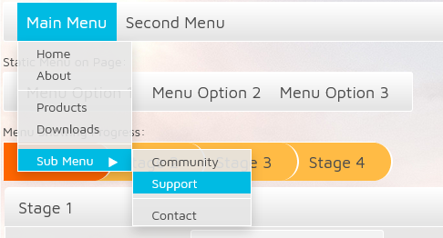 To create this type of menu structure, a nested menu fragment should be used, like the following example:
<menu id="header_menu" xmlns="http://www.hyfinity.com/mvc">
<item hint="Main Menu with Sub Menu of Options" id="item1" value="Main Menu">
    <menu>
        <item hint="Home Page" id="home" value="Home">
            <event action="http://www.hyfinity.com" name="href" />
        </item>
        <item hint="About Message" id="about" value="About">
            <event action="alert('Hyfinity Limited');" name="onclick" />
        </item>
        <separator />
        <item hint="Link to Products" id="products" value="Products">
            <event action="http://www.hyfinity.com/#products" name="href" />
        </item>
        <item hint="Link to Downloads" id="downloads" value="Downloads">
            <event action="http://www.hyfinity.com/#downloads" name="href" />
        </item>
        <separator />
        <item hint="Sub Menu of Further Options" id="" value="Sub Menu">
            <menu>
                <item hint="Link to Community" id="community" value="Community">
                    <event action="http://www.hyfinity.com/#community" name="href" />
                </item>
                <item hint="Link to Support" id="support" value="Support">
                    <event action="http://www.hyfinity.com/#support" name="href" />
                </item>
                <separator />
                <item hint="Link to Contact" id="contact" value="Contact">
                    <event action="http://www.hyfinity.com/#contact" name="href" />
                </item>
            </menu>
        </item>
    </menu>
</item>
<item id="item2" value="Second Menu">
    <menu>
        <item id="option1" value="Log In" />
        <item id="option2" value="Register" />
    </menu>
</item>
</menu>
For each drop down menu that is required, a second level menu fragment should be placed within the item that will act as the parent of that menu. Further menus can also be nested to create complex scenarios. Each of these sub menus can also contain 'separator' elements to create dividing lines as shown in the example above.
By default, a top level menu element needs to be clicked for the next level drop down menu to be displayed. Alternatively, lower level menus can be shown on hover of higher level menu items. This can be achieved by adding a Custom Attribute to the menu control. This should be called data-dojo-props, and be given a value of passivePopupDelay:100. The number indicates how many milliseconds you will need to hover over the menu before the sub level options are shown, and can therefore be adjusted accordingly.